7 Essential Elements for a High-Converting Landing Page (FREE "Is Your Landing Page Conversion-Ready?" Quiz Inside!)
By: Hayden Jarman

When it comes to landing pages, most people are just throwing spaghetti at the wall.
The problem? Too many forget that a landing page is more than just a page. It's your first—and sometimes only—chance to convert a visitor into a buyer.
And in today’s environment, you’ve got mere seconds to make that conversion happen.
You might think you’ve covered all your bases, but without these seven essential elements, your landing page could be leaving serious money on the table.
Also, if your website hasn't been updated in a while, it might be worth considering a redesign that could impact your SEO performance. You can learn more about that here.
Let’s break down exactly what separates a high-converting landing page from one that’s dead on arrival.
We’re not just talking theory here—everything we’re about to cover is based on actionable data and trends you can start using today to move the needle on your conversion rates.
📊 Is Your Landing Page Conversion-Ready? 🔍
Table of Contents:
- The Headline That Grabs Attention (And Doesn't Let Go)
- Calls-to-Action That Actually Convert
- Persuasive Copy That Speaks to Your Audience
- Build Trust with Social Proof
- Clean Design and Visual Hierarchy
- Lightning-Fast Load Time
- Optimized for Mobile
- Final Thoughts: Time to Audit Your Landing Page
1. The Headline That Grabs Attention (And Doesn't Let Go)
Your headline is the hook.
And if it’s weak, visitors won’t stick around long enough to read anything else. The headline has one job: to grab attention and communicate your value instantly.
If your website is outdated or hasn’t had a recent overhaul, it may be worth considering whether your website needs updating, which you can explore in more depth here.
Best Practices:
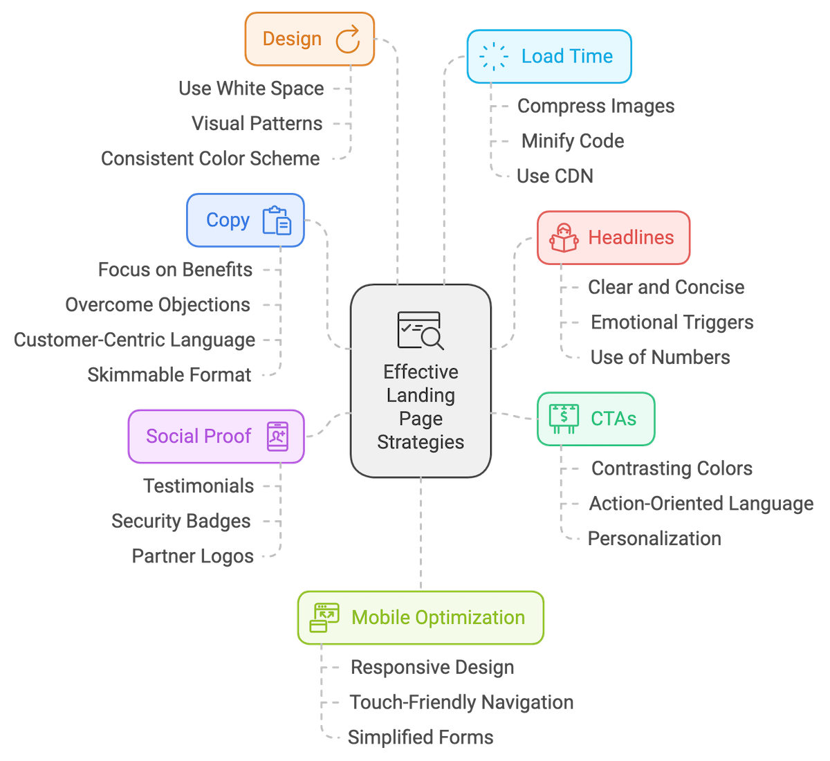
- Be clear and concise: Avoid the fluff. Make sure your headline tells the visitor exactly what they can expect.
- Emotional triggers: Tap into your visitor's emotions by using power words that evoke curiosity, excitement, or urgency.
- Numbers win: Headlines with numbers (e.g., “Save 30% in 5 Minutes”) can increase click-through rates by 36%.
Data:
Landing pages with strong, clear headlines can see conversion rates increase by up to 300%.
Here’s a challenge: take your headline and A/B test it. Use tools like Optimizely to test different variations.
Split test benefit-driven vs. feature-driven headlines, and see what resonates. Spoiler alert: benefits almost always win.
Example:
A landing page headline like "Our Services" is dead in the water.
Compare that to "Cut Your Software Costs by 40% in Under 5 Minutes," and you'll see why headlines matter. The latter promises something specific, urgent, and valuable.
2. Calls-to-Action That Actually Convert
Your Call-to-Action (CTA) is where the magic happens.
Yet, too many CTAs blend into the background or don’t clearly tell the visitor what to do. If your landing page isn’t converting, it could be a sign that your website's user experience needs attention.
To dive deeper into why your website might not be ranking well in Google, check out this article on why your website isn't ranking.
Best Practices:
- Use contrasting colors: Make sure your CTA stands out from the rest of your design.
- Action-oriented language: Start with strong verbs like “Get,” “Start,” or “Download.”
- Make it personal: Personalized CTAs can convert 202% better than generic ones. If you can, tailor your CTA to the specific user (e.g., “Get My Free Guide”).
The Sticky Trend:
Sticky CTAs that follow the user as they scroll keep that action front and center, making it easy for them to convert no matter where they are on the page.
Example:
A sticky CTA that says “Get Started Now” will outperform a static CTA buried at the bottom of the page.
The difference? Conversion rates for sticky CTAs can increase by 20%.
3. Persuasive Copy That Speaks to Your Audience
Your landing page copy needs to be concise, benefit-driven, and designed to remove all objections.
Don’t just describe what you do—tell them why it matters. If your copy is filled with repeat info, it may be harming your SEO. To learn more, explore this post.
Best Practices:
- Focus on benefits, not features: Instead of saying, "We have the best software," say, "Our software will save you hours of work."
- Overcome objections: Address concerns like price or complexity right in your copy.
- Use customer-centric language: Speak directly to your visitor's needs, and avoid corporate jargon.
- Skimmable format: Break your copy into short paragraphs and use bullet points to make it easy to read.
AI Copywriting:
Leverage tools like Jasper AI to create hyper-personalized copy. AI can help you A/B test different variations, allowing you to refine your message faster.
Example:
Benefit-driven copy: “Our accounting software will save you 10 hours a week by automating your bookkeeping.” Feature-driven copy: “Our software integrates with QuickBooks and Xero.”
Which one do you think converts better? (Hint: It’s the one that shows the result, not just the feature.)
4. Build Trust with Social Proof
People don’t like to be the first ones to take the leap.
They want to see that others have already trusted you—and gotten results. That’s where trust signals come in.
Adding a 301 redirect after a website redesign is also a crucial step to ensure that visitors (and Google) trust your site after changes, as explained here.
Best Practices:
- Include testimonials: Testimonials from satisfied customers work wonders. If you can, include a video testimonial—it’s more engaging and trustworthy than text alone.
- Security badges and guarantees: Placing a “Money-Back Guarantee” or “100% Secure” badge can reduce hesitation. Learn more about securing your website with SSL in this post.
- Partner logos: Display logos of well-known clients or partners.
Video Testimonials:
In 2023, video testimonials have become a powerful trust signal. They engage visitors in ways text testimonials can’t.
Data:
Displaying security badges can increase conversions by up to 42%.
Example:
Imagine you’re choosing between two services. One has a simple text testimonial.
The other features a video of a happy customer walking you through their experience.
Which one builds more trust? Exactly.
5. Clean Design and Visual Hierarchy
You’ve only got a few seconds to guide your visitor’s attention, and design is your secret weapon.
And don’t forget the impact a redesign could have on your SEO. If you’re planning a website redesign, make sure to consider the factors laid out here.
Best Practices:
- Use white space: Avoid clutter by using plenty of white space to let your content breathe.
- Visual patterns: Follow the F-pattern or Z-pattern to guide users through the content naturally.
- Consistent color scheme: Stick to a color scheme that aligns with your brand and doesn’t overwhelm the visitor.
The Minimalist Trend:
Less is more. In recent years, minimalist design with bold typography has been trending because it reduces cognitive load and makes it easier for visitors to focus on the CTA.
Data:
94% of first impressions are design-related, meaning a cluttered or poorly designed page can send visitors running for the hills.
6. Lightning-Fast Load Time
You’ve heard it before: speed kills.
Well, a slow load time can kill your conversion rates. Every second counts—literally. And as you revamp your site, make sure it's responsive for mobile and optimized for load times.
This post outlines why having a responsive website is essential.
Best Practices:
- Compress your images: High-quality images are great, but they shouldn’t slow down your load time.
- Minify your code: Remove unnecessary characters in your CSS, JavaScript, and HTML.
- Use a Content Delivery Network (CDN): Speed up load times by distributing your content across multiple servers.
The 3-Second Rule:
Your landing page should load in under 3 seconds. Period.
Data:
A 1-second delay in load time can reduce conversions by 7%.
Example:
Compare two websites.
One loads in under 3 seconds, the other in over 5 seconds. The slower one is losing out on potential conversions with every passing second.
7. Optimized for Mobile
Over 50% of web traffic comes from mobile devices.
If your landing page isn’t optimized for mobile, you’re losing out on a massive chunk of potential conversions.
Your website should be responsive, and this article covers why it's important for your business.
Best Practices:
- Responsive design: Ensure your landing page works flawlessly on screens of all sizes.
- Touch-friendly navigation: Make buttons large enough to be easily tapped.
- Simplified forms: Long forms are a conversion killer on mobile. Keep it short and sweet.
Mobile-First Design:
In 2024, mobile-first design isn’t just a trend—it’s the standard.
Google now prioritizes mobile-optimized sites in search rankings, so if your landing page isn’t responsive, you're hurting both your conversions and your SEO.
Data:
Mobile devices account for approximately 54.8% of global web traffic.
Example:
Imagine trying to fill out a long, complicated form on a mobile device. Frustrating, right? Now picture a simplified form that’s optimized for touch.
That’s the difference between losing a customer and making a sale.

Final Thoughts: Time to Audit Your Landing Page
You’ve got the seven essential elements.
Now, it’s time to put them to work. Whether you're starting from scratch or refining an existing page, use this framework to audit your landing pages. Test, tweak, and refine each of these elements until your conversion rates soar.
If you're considering a redesign, it’s crucial to make sure your site maintains strong SEO, so don't forget to look at how a redesign might impact your rankings by reading this post.
Remember, creating a high-converting landing page isn’t a one-and-done job. It’s an ongoing process of optimization. But by implementing these seven essentials, you’re stacking the deck in your favor.
Here’s a simple challenge: Go back to your landing page and audit it based on these seven elements.
You’ll be surprised at how a few tweaks here and there can lead to massive improvements.
Additional Resources
For readers interested in diving deeper into the best practices and strategies for creating high-converting landing pages, here are some valuable resources:
- Unbounce: 11 Landing Page Best Practices
- HubSpot: Landing Page Best Practices
- Neil Patel: Landing Page Optimization
- Instapage: Landing Page Best Practices
- ConversionXL: Advanced Landing Page Optimization Techniques
Need Help Optimizing Your Landing Pages?
If you're looking to take your landing pages to the next level, BlueTone Media is here to help.
We specialize in designing and optimizing high-converting landing pages that drive real results.
Reach out to us today, and let's start crafting a landing page that works for your business.
Related Posts:
- Understanding Google’s Local Pack: How to Get Featured
- Google Business Profile FAQs: Everything You Need to Know
- The Best Google Ads Extensions to Boost Your Click-Through Rates
- How to Leverage Facebook Groups for Local Business Leads
- How to Use AI to Write Better Social Media Captions
- How to Optimize Google Reviews to Attract More Customers
- LinkedIn for B2B Marketing Success
- How to Conduct a Social Media Audit (w/ "Audit Readiness" Quiz!)
- Creating a Content Calendar for Consistent Posting
- The Importance of Mobile Optimization in 2024
- Data Privacy Regulations: What Marketers Need to Know
- The Role of Chatbots in Enhancing Customer Service
- SEO for Small Business: The Ultimate Guide to Getting Found Online
- The Role of Keyword Clustering in Modern SEO

