Constantly Evolving
Working for a web design company has been so different from anything I've ever done before. We're always trying to figure out new and better ways to do everything. My role here at BlueTone Media is to do a little bit of design and a little bit of coding, while handling customer service and writing the occasional third person biography. With design, I create the pages after Stephen comes up with a sharp template that the customer approves. And with the development part, I code the pages after Jimmy takes the approved mockup and builds the template online. So I realized quickly that there was one thing I could try and improve the quality of here for BlueTone Media - the contact form.
Now there was nothing wrong with the contact forms that Jimmy built, but these were the main part of web sites that I could get creative with, since I would be designing AND building them. So what I've learned in my short time here so far is:


Now there was nothing wrong with the contact forms that Jimmy built, but these were the main part of web sites that I could get creative with, since I would be designing AND building them. So what I've learned in my short time here so far is:
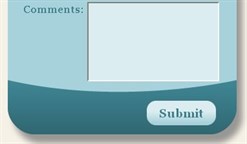
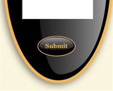
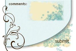
- You can have background images be the contact form
- Submit buttons don't have to be boring gray boxes anymore.
- Text fields can change color when active. They can also be images that you type in (although, we've still found some bugs with this in IE. It seems if you type too much, the image slides over. Still searching for a fix).


