Change
Last week brought a huge change to the nation, with our country's first African-American president and the first democrat elected this century. President Obama's campaign focused on change and his first week in office supported what he stated. I'm not sure if you noticed, but at noon on Inauguration Day
whitehouse.gov
got a brand new look, as well. Let's take a look at the history of whitehouse.gov to see where we came from and where we are today...

Ooof. This is rough. Keep in mind that this is from around 1995, the earlier half of the Clinton Era. Things could only get better...
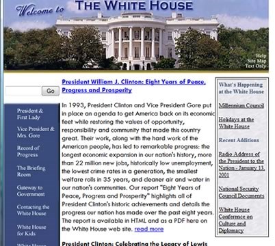
...but not much better. This is from the last of the Clinton Era, around 2001. It's left justified and has lefthand navigation. A lot more information here.
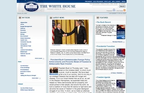
Things get a lot better with Bush's version. We still have the lefthand navigation, which lists a ton of links. Fortunately, no more left justification, but centered now! Still, room for improvement.
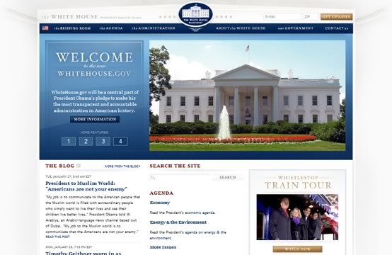
Now this is a slick web site. They finally ditched the lefthand, overwhelming, vertical navigation and now have a horizontal bar with drop down menus. Below that is the nice "Features" area that rotates through the latest stories (similar to several news web sites like Yahoo, MSN, and ESPN). Then you have three useful columns at the bottom. The look of this is much better than anything before, showing off classy swirls and relaxing color choices. The gold buttons are my favorite part - they just add in a nice little separation from the rest of the site. This site is easy to navigate, easy to read, and easy on the eyes. Well done. This is definitely a change I can believe in.

Ooof. This is rough. Keep in mind that this is from around 1995, the earlier half of the Clinton Era. Things could only get better...

...but not much better. This is from the last of the Clinton Era, around 2001. It's left justified and has lefthand navigation. A lot more information here.

Things get a lot better with Bush's version. We still have the lefthand navigation, which lists a ton of links. Fortunately, no more left justification, but centered now! Still, room for improvement.

Now this is a slick web site. They finally ditched the lefthand, overwhelming, vertical navigation and now have a horizontal bar with drop down menus. Below that is the nice "Features" area that rotates through the latest stories (similar to several news web sites like Yahoo, MSN, and ESPN). Then you have three useful columns at the bottom. The look of this is much better than anything before, showing off classy swirls and relaxing color choices. The gold buttons are my favorite part - they just add in a nice little separation from the rest of the site. This site is easy to navigate, easy to read, and easy on the eyes. Well done. This is definitely a change I can believe in.

